Secondary 4 Statistics Worksheet
Two ideas run through the whole Secondary 4 statistics unit: how spread out is this distribution, and how strong is the link between these two variables? The sheet answers both — mean deviation and standard deviation, percentile and quintile rank, describing a correlation and estimating its coefficient, the Mayer line and the median-median line, z-scores, sampling, and choosing a graph that does not mislead. Print it at no cost, or read through it on screen first — either way there is nothing to join.
Practice worksheet — free PDF
No email, no account, no watermark. Teachers: photocopy it for your classes freely. Worked solutions and 15 harder problems come with the Secondary 4 Math bundle.
11 of the 17 questions
Each question targets one named concept from the sheet. Read them here, or print the PDF — it has working space under each one. 11 of the 17 questions are printed below. The other 6 are built on a diagram or a table of values that does not translate to the page, so they are in the free PDF — marked below where they would have come.
-
Q1Correlation of a Distribution
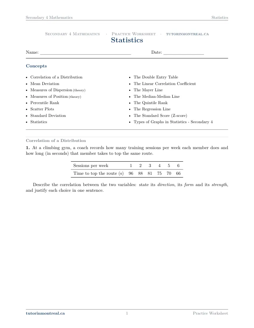
This question is built around a diagram or a table of values. Open it in the PDF.
-
Q2Mean Deviation
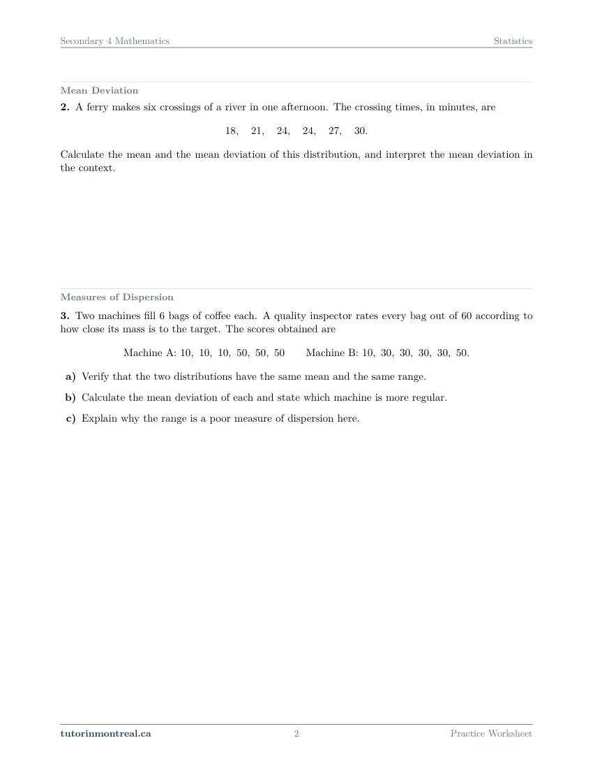
A ferry makes six crossings of a river in one afternoon. The crossing times, in minutes, are Calculate the mean and the mean deviation of this distribution, and interpret the mean deviation in the context.
-
Q3Measures of Dispersion
Two machines fill bags of coffee each. A quality inspector rates every bag out of according to how close its mass is to the target. The scores obtained are
- Verify that the two distributions have the same mean and the same range.
- Calculate the mean deviation of each and state which machine is more regular.
- Explain why the range is a poor measure of dispersion here.
-
Q4Measures of Position
- Sort the following into measures of position and measures of dispersion: the minimum, the mean deviation, , the third quartile, the standard deviation, , the range, the maximum.
- A measure of position tells you nothing about how spread out a distribution is. Illustrate this by giving two distributions of five values each in which the value has the same percentile rank but the ranges are very different.
-
Q5Percentile Rank
Twenty archers each shoot one end. Their scores, in ascending order, are
- Determine .
- Determine .
-
Q6Scatter Plots
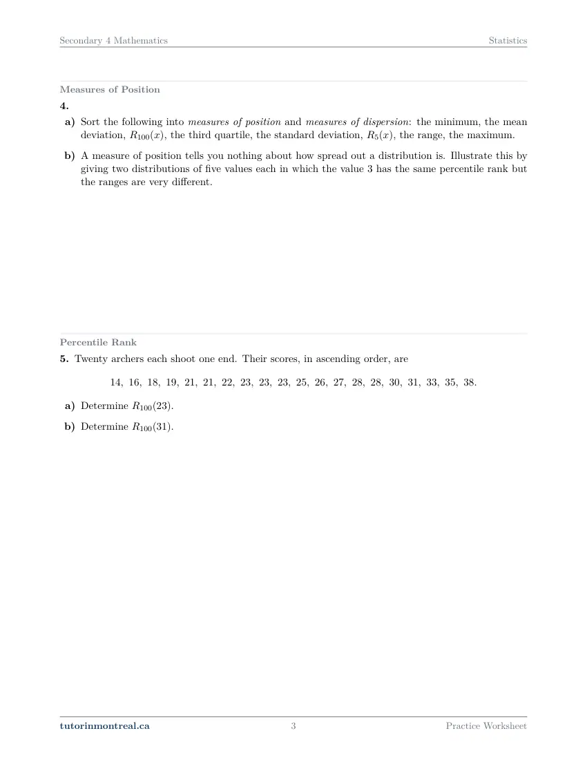
This question is built around a diagram or a table of values. Open it in the PDF.
-
Q7Standard Deviation
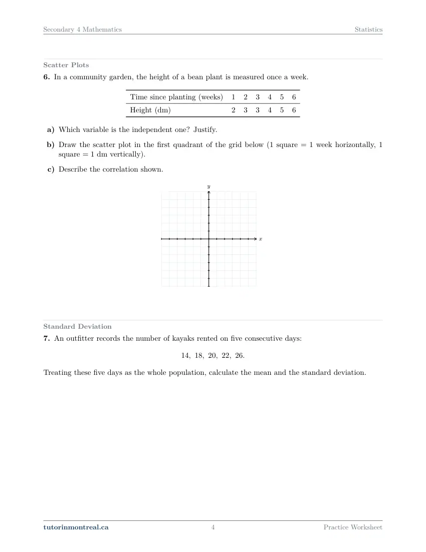
An outfitter records the number of kayaks rented on five consecutive days: Treating these five days as the whole population, calculate the mean and the standard deviation.
-
Q8Statistics
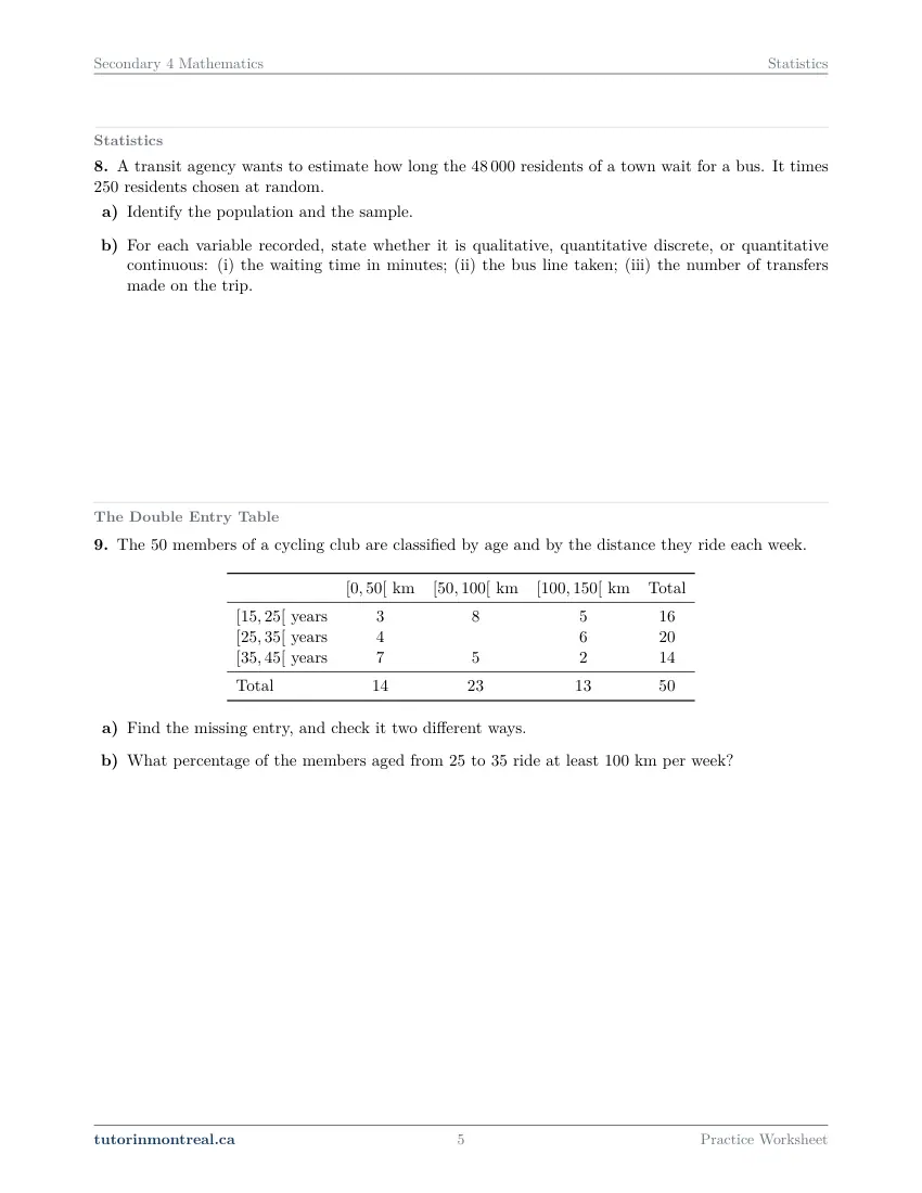
A transit agency wants to estimate how long the residents of a town wait for a bus. It times residents chosen at random.
- Identify the population and the sample.
- For each variable recorded, state whether it is qualitative, quantitative discrete, or quantitative continuous: (i) the waiting time in minutes; (ii) the bus line taken; (iii) the number of transfers made on the trip.
-
Q9The Double Entry Table
This question is built around a diagram or a table of values. Open it in the PDF.
-
Q10The Linear Correlation Coefficient
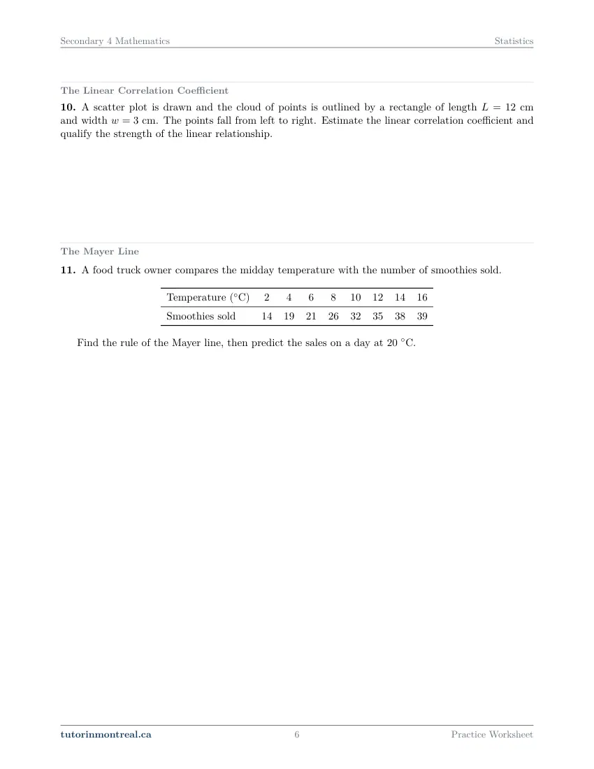
A scatter plot is drawn and the cloud of points is outlined by a rectangle of length cm and width cm. The points fall from left to right. Estimate the linear correlation coefficient and qualify the strength of the linear relationship.
-
Q11The Mayer Line
This question is built around a diagram or a table of values. Open it in the PDF.
-
Q12The Median-Median Line
This question is built around a diagram or a table of values. Open it in the PDF.
-
Q13The Quintile Rank
Fifteen robotics teams score the following points in a qualifying round, listed in descending order:
- Find using the formula.
- Find by separating the distribution into five groups, and check it with the formula.
-
Q14The Regression Line
A candle maker models the mass (in grams) of a burning candle after hours by the regression line .
- Interpret the values and in this context.
- Predict the mass after h of burning.
- After how many hours is the candle completely consumed, according to the model?
-
Q15The Standard Score (Z-score)
On a physics test, the group mean is and the standard deviation is . Sofia scored .
- Calculate Sofia's standard score.
- Another student has a standard score of . What was their mark?
-
Q16Types of Graphs in Statistics –
For each situation, name the most appropriate type of graph and justify your choice in one sentence.
- The share of a town's recycling made up of glass, paper, metal and plastic.
- The monthly water level of a reservoir over three years.
- The distribution of the finishing times of a road race, grouped in classes of minutes.
- The link between the number of hours of sunshine and the mass of tomatoes harvested on farms.
-
Q17Synthesis — drawing on several sheets in this topic
This question is built around a diagram or a table of values. Open it in the PDF.
The 15 challenge problems for this topic are a separate, paid sheet and are not reproduced here.
Which stream is this for? This sheet is built for SN. It assumes you are computing standard deviations and z-scores, fitting a line to a scatter plot by the Mayer and median-median methods, and estimating a correlation coefficient, and it goes to the depth that program expects.
How to do every concept on this sheet
This is the part worksheet sites usually leave out. Below is the actual reasoning behind each group of questions — not a full solution set, the decisions that get you to one. Read it before you start, or after you get stuck.
Position or dispersion? The distinction the unit is built on
Q4 asks you to sort eight measures into two families, and almost every other question on the sheet belongs to one of them. The difference is worth stating in one line each: a measure of position locates a single value among the others, while a measure of dispersion describes how spread out the whole distribution is.
Position: minimum, maximum, quartiles, percentile rank R100(x), quintile rank R5(x), and the z-score — each answers "where does this value sit?"
Dispersion: range, mean deviation, standard deviation, interquartile range — each answers "how far apart are the data?"
Part (b) of Q4 wants a pair of distributions that pins the two ideas apart. The trick is to keep the ranks identical while pulling the extremes apart: how many values sit below 3 has nothing to do with whether the largest value is 5 or 500.
Mean deviation, standard deviation, and why the range is the weak one
Q2 asks for a mean deviation, Q7 for a standard deviation, and Q3 makes the case for both by showing what the range misses. All three start the same way: compute the mean, then measure every value's distance from it.
MD = Σ|x − x̄| ⁄ n σ = √( Σ(x − x̄)² ⁄ n )The absolute value and the square are there for the same reason: the signed deviations of any distribution always add to exactly zero, so without one of those two devices every distribution would look perfectly regular. Take 4, 6, 11: the mean is 7, the deviations are −3, −1 and +4, and they sum to 0 — but their sizes are 3, 1 and 4, giving a mean deviation of 8⁄3.
The mistake: reporting a spread without saying what it is a spread of. Q2 asks you to interpret the number in context, and the sentence is part of the answer: a mean deviation of 3 minutes means a typical crossing differs from the average crossing by about 3 minutes. A number with no unit and no sentence rarely takes the full mark.
Q3 is the argument for bothering at all. The range uses two values and ignores everything between them, so two distributions with the same extremes are indistinguishable by range even when one is bunched at the middle and the other is stacked at the ends. The mean deviation and the standard deviation use every value, and they separate those two cases immediately.
Percentile rank and quintile rank point in opposite directions
Q5 and Q13 use nearly the same formula and are read in opposite senses. In both, a value tied with others counts half of the ties — including itself.
R₁₀₀(x) = [ (number below x) + ½(number equal to x) ] ⁄ n × 100 R₅(x) = [ (number above x) + ½(number equal to x) ] ⁄ n × 5Computing a rank without slipping
The counting step is where the marks are, not the arithmetic.
- 1Decide which direction is "better"
Points, marks and heights: bigger is better. Times over a fixed distance: smaller is better. Q17(d) turns on exactly this, so the data "worse than" a runner are the slower ones.
- 2Count the values strictly beyond it
For a percentile rank, count the data strictly worse; for a quintile rank, count the data strictly better. Sort the list first — an unsorted count is how a rank goes wrong.
- 3Add half the ties, yourself included
Three values equal to 23 contributes 1.5, not 1 and not 3. That half is why a rank can exceed the plain percentage of people you beat.
- 4Divide by n, scale, and round up
×100 for a percentile, ×5 for a quintile. A non-whole result is always rounded up, whichever decimal it is — 42.5 becomes 43 and 3.1 becomes 4.
- 5Read the scale the right way round
Percentile ranks count the data below, so a high rank is a strong performance. Quintiles are numbered from the top down, so the first quintile holds the best fifth and a low rank is the strong one.
Describing a correlation: three separate words
Q1 and Q6(c) both ask you to describe a correlation, and a full answer contains three independent judgments, each with its own justification.
Direction — positive if y rises with x, negative if it falls. Read it off the data, not the picture.
Form — linear if the successive changes in y are roughly constant for equal steps in x; otherwise curved.
Strength — strong if the points hug one straight line, weak if the cloud is fat. Name the point that departs most from the trend; that single observation is usually what the marker is looking for.
Strength is not steepness. Stretching the vertical axis makes a cloud look dramatic without moving a single data value, and correlation is a property of the data, not of the drawing. The same warning applies in reverse: a relationship can be perfect and yet show no linear correlation, because the correlation studied here measures closeness to a straight line and nothing else.
Q10 turns the description into a number using the rectangle that encloses the cloud, with L the longer side and w the shorter:
r ≈ ± ( 1 − w ⁄ L )The sign comes from the direction and must be put in by hand — the formula cannot know it. Since w ≤ L by definition, the estimate always lands in [−1, 1]. A long thin rectangle gives a value near ±1 (strong); a rectangle close to square gives a value near 0, meaning no direction can be read at all. As a rough scale, past about ±0.9 is very strong, around ±0.75 is moderate, and below about ±0.5 is weak.
Two lines through a cloud, and when to prefer each
Q11 asks for a Mayer line and Q12 for a median-median line. Both replace a cloud with a handful of representative points, and both start by ordering the pairs by x — forgetting that step is the single most common way to lose the question.
The Mayer line, step by step
Two groups, two mean points, one line.
- 1Order by x and split into two equal groups
With an odd number of pairs, one group takes the extra pair; say which one you chose.
- 2Take the mean point of each group
P₁ is (mean of that group's x-values, mean of its y-values), and likewise P₂ — the means are computed separately.
- 3Slope, then intercept
a = (y₂ − y₁)/(x₂ − x₁), then substitute either point intoy = ax + b. Verify with the other point; it costs one line and catches every arithmetic slip. - 4Use the rule, don't re-read the graph
A prediction is a substitution into the rule. The mean point of the whole distribution lies on this line, which is a free check when the two groups are the same size.
The median-median line follows the same shape with three groups instead of two. Order by x, split into three groups as equal as possible — with a leftover pair the middle group takes it, with two leftovers the outer groups take one each — then form each group's median point by taking the median of its x-values and the median of its y-values separately. The slope comes from the first and third median points; the line is then made to pass through the mean of the three median points.
The median point is not a data point. Pairing the median x with the median y can produce a point that is nowhere in your table, and that is correct — the two medians are taken independently.
Which line to trust: the median-median line resists outliers, because raising the largest value in a group leaves that group's median untouched. A mean is dragged towards every distant point, so the Mayer line tilts. When one observation is far from the rest, prefer the median-median line and say why.
Reading a regression line, and knowing when to stop trusting it
Q14 hands you a rule instead of data and asks what its numbers mean. In y = ax + b the slope a is a rate of change carrying a unit — grams per hour, dollars per customer — and its sign says whether the quantity grows or shrinks. The constant b is the value at x = 0, the initial value.
Because the slope has a unit, changing the unit of x changes the slope: a rate of 1.4 per week is a rate of 0.2 per day, not 1.4 per day. The initial value is the one number that survives the conversion untouched.
Predicting inside the range covered by the data is interpolation and is reasonably safe. Predicting far outside it is extrapolation, and Q17(c) is built to catch it: a linear model of running times keeps improving forever and eventually predicts a time of zero, which is where the model, not the algebra, has failed. Say so explicitly when a question asks for a caution.
Z-scores: making two different tests comparable
Z = ( x − x̄ ) ⁄ σQ15 is the whole idea in two parts. A z-score reports how many standard deviations a value sits above (positive) or below (negative) its own mean, which is what makes marks from two different groups comparable — a raw mark on its own is measured against a mean and a spread you are not being shown. Comparing two raw marks from two distributions proves nothing.
Part (b) runs the formula backwards. Rather than rearranging in the abstract, multiply across: x = σZ + x̄. A negative z-score must give a value below the mean; if yours does not, you have added where you should have subtracted.
Population, sample, and the type of every variable
Q8 is vocabulary, and it is marked strictly. The population is everyone the conclusion is about; the sample is only the individuals actually measured. Then each variable recorded gets one of three labels:
Qualitative — a label or category. A bus line number is qualitative even though it looks like a number: averaging it would be meaningless.
Quantitative discrete — counted, so only whole values occur: number of transfers, number of siblings.
Quantitative continuous — measured, so any value in an interval is possible: a waiting time, a mass, a height. The test is whether a value halfway between two observations makes sense.
A sample is representative when every part of the population has a fair chance of appearing in it. Collecting all your data at one place, at one hour, on one day builds bias in three separate ways, and the fix is a sampling method that spreads the draw across the population — a stratified sample drawn in proportion from each group, or a systematic sample taken across all locations and times.
Double-entry tables: the interior holds the information
Q9 gives a table with one cell blank. Fill it from its row, then check it from its column — the question asks for both, and the two routes must agree.
The mistake: using the grand total as the denominator. "What percentage of the members aged 25 to 35 ride at least 100 km" restricts you to that row, so the denominator is that row's total, not the whole club. Read which group the question is asking about, and only then look for a numerator.
The margins of a table describe each variable separately: they say how many members fall in each age band and how many in each distance band, but nothing about which pairs occur together. Any relationship between the two variables lives in the interior cells. Two tables can share every margin and still tell opposite stories.
Choosing a graph (Q16)
Each type answers one kind of question, and the justification is the mark:
Circle graph — how a whole divides into parts that add to 100 %. Broken-line graph — the evolution of one quantitative variable over time. Histogram — a continuous variable grouped into classes, so the bars touch and their widths are the classes. Bar graph — a qualitative variable, so the bars stand apart. Scatter plot — two quantitative variables recorded on the same individuals, when the link between them is the point. Box-and-whisker plot — comparing position and spread between groups.
One property of the box plot is worth memorising because it is counter-intuitive: each of its four sections holds about a quarter of the data whatever the size of the group. A longer box means more spread, never more people. To compare consistency between two groups, compare their interquartile ranges, Q₃ − Q₁.
The synthesis question (Q17)
The last question runs four of the sheet's methods over one distribution: describe the correlation, fit a Mayer line, use the rule to predict and then criticise that prediction, and finish with a percentile rank. Work it in that order — the line you fit in part (b) is what part (c) substitutes into, and part (d) needs the "which direction is better?" decision from the rank procedure above, because a faster time is the better performance.
Preview all 10 pages
Click any page to open the full PDF.
Getting the most out of it
Redraw the table before you compute anything
For every question with data in it, rewrite the values in a column and put the deviations, the squares or the group means beside them. Most lost marks on this sheet are bookkeeping, not method, and a column of numbers you can point at is what makes an error findable.
Interpret every number in a sentence
Mean deviation, slope, z-score, percentile rank: each of them is asked for with an interpretation somewhere on this sheet. Practise the sentence with the unit in it — "on average, 3 minutes from the mean crossing time" — because that sentence is what an exam pays for and it is also your best error check.
Do the vocabulary questions last, as a review
Q4, Q8 and Q16 are naming questions and look like the easy ones. Come back to them after the computing questions and they turn into a summary of everything you have just done, which is the form they usually take on an exam.
Want the solutions, or something more challenging?
The worksheet, the questions above and every explanation on this page stay free permanently. Three more PDFs exist for this topic — the worked answer key, a harder problem set, and the answer key to that. They come with the Secondary 4 Math Solutions Bundle, which is what keeps the rest of the series free.
What else exists for Statistics
Three PDFs · 18 pages · all three are in the bundle below.
- Answer key — 4 pages. All 17 questions worked step by step, including the restrictions and the justifications. Not a list of final answers.
- Challenge problems — 10 pages, 15 problems. A separate sheet at exam-plus difficulty covering the same 16 concepts. Harder than anything on the free sheet.
- Challenge answer key — 4 pages. Every challenge problem worked to the same standard, with the checks shown.
- PDF, letter size, print-ready.
The one thing that's for sale
Every Secondary 4 Math topic — the complete Solutions Bundle
One download, one payment, the whole program. Every answer key and every challenge set for all 17 Secondary 4 Math worksheet sets — including this one.
- Worked solutions, not answer lists — every step written out
- Covers the whole year's program at this level
- Less than the price of one hour of tutoring — for the entire year's solutions
Taking Secondary 1 Math as well? The Secondary 1 Math bundle covers all 15 of its sets — 45 PDFs, 182 pages — on the same terms.
Taking Secondary 2 Math as well? The Secondary 2 Math bundle covers all 14 of its sets — 42 PDFs, 181 pages — on the same terms.
Taking Secondary 3 Math as well? The Secondary 3 Math bundle covers all 11 of its sets — 33 PDFs, 154 pages — on the same terms.
Taking Secondary 5 Math as well? The Secondary 5 Math bundle covers all 21 of its sets — 63 PDFs, 228 pages — on the same terms.
Taking CEGEP Calculus I as well? The CEGEP Calculus I bundle covers all 8 of its sets — 24 PDFs, 82 pages — on the same terms.
Taking CEGEP Calculus II as well? The CEGEP Calculus II bundle covers all 8 of its sets — 24 PDFs, 90 pages — on the same terms.
Taking CEGEP Linear Algebra as well? The CEGEP Linear Algebra bundle covers all 7 of its sets — 21 PDFs, 82 pages — on the same terms.
Taking AP Calculus AB as well? The AP Calculus AB bundle covers all 8 of its sets — 24 PDFs, 126 pages — on the same terms.
Common questions
Is this worksheet really free?
Yes — the questions are on this page to read, and the PDF downloads directly, no email and no account. The one paid item is optional: the complete Secondary 4 Solutions Bundle, which covers every set at this level.
What is the difference between the Mayer line and the median-median line?
The Mayer line splits the ordered pairs into two groups and joins their mean points. The median-median line uses three groups and their median points, taking the slope from the first and third and passing the line through the mean of the three. Because medians ignore how far away a distant value is, the median-median line resists outliers while the Mayer line is pulled towards them.
Why do I add half of the tied values in a percentile rank?
Because a value tied with others is neither above nor below them, so the convention splits the ties evenly and counts half of them, yourself included. That half is why a percentile rank is slightly higher than the plain percentage of the group you beat. Whatever the formula returns, a non-whole result is then rounded up, never to the nearest whole number.
Can two variables be perfectly related and still show no correlation?
Yes. The correlation studied here measures how close the points are to a single straight line, so a perfectly determined U-shaped relationship has a linear correlation of zero. Strong relationship and strong linear correlation are two different statements, and a scatter plot is what tells them apart.
What does a z-score actually tell me?
How many standard deviations a value sits above or below the mean of its own group. That is what makes results from two different tests comparable, because a raw mark is measured against a mean and a spread that differ from one group to the next.
Which Secondary 4 stream is this for?
It is built for SN. The sheet assumes you are computing standard deviations and z-scores, fitting lines to a scatter plot and estimating a correlation coefficient, and it goes to the depth that program expects.
Can teachers use this in class?
Yes. Print and photocopy it for your own classes freely — I just ask that the tutorinmontreal.ca footer stays on the page.
I'm stuck on one question. Can you help?
Yes — through one-on-one tutoring, in Montreal or online. Get in touch to arrange a session, or see the current rates.
← All 17 Secondary 4 Math worksheets · Secondary 1 Math series (15 sheets) → · Secondary 2 Math series (14 sheets) → · Secondary 3 Math series (11 sheets) → · Secondary 5 Math series (21 sheets) → · CEGEP Calculus I series (8 sheets) → · CEGEP Calculus II series (8 sheets) → · CEGEP Linear Algebra series (7 sheets) → · AP Calculus AB series (8 sheets) →
The same topic at the other level: Secondary 5 Math · Statistics.